The Design System · Agilysys · 2017—Today
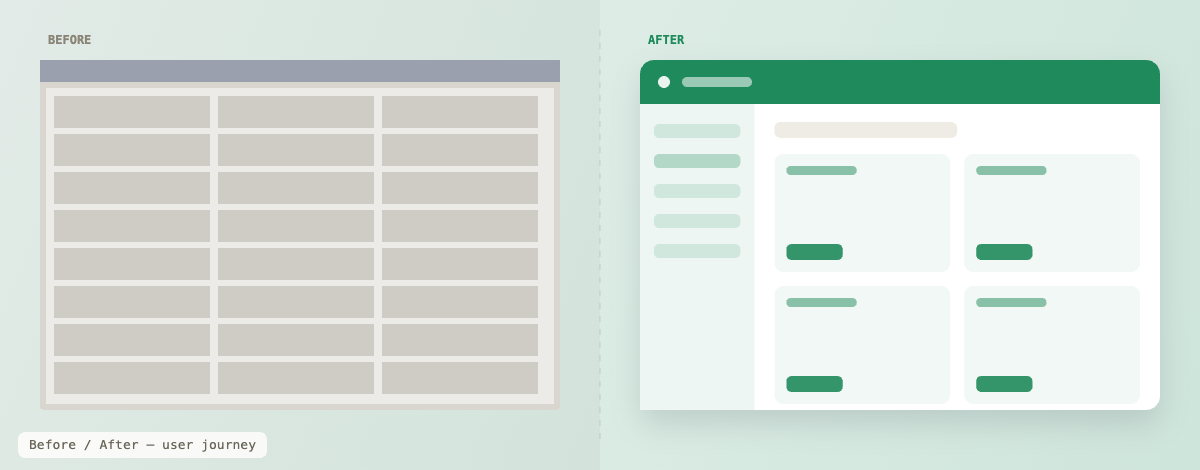
One portfolio. Zero consistency.
When I joined Agilysys in 2017 the product landscape was vast and fragmented. PMS, POS, Inventory and a wide ecosystem of interconnected applications — all built on legacy Visual Basic and .NET. Complex interfaces. No visual language. No shared components. No design foundation of any kind.
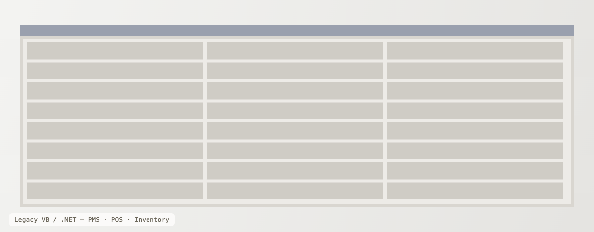
Build the foundation once. Build it right.
The mandate was clear: rebuild everything into modern, cloud-based SaaS. But as we began, something became apparent — PMS was not one product. It was a family, a whole ecosystem of interrelated applications waiting in the backlog. Redesigning them one by one would recreate the exact problem we were solving, just in a newer stack.
Twenty years of building consistent, scalable interfaces had taught me one thing: the only way to maintain quality at this scale is a shared system every product draws from — not a redesign of each from scratch. That was the moment the design system was born.
One system, shared
Every application — PMS, POS, SPA, Golf, Inventory and beyond — draws from the same component library, layout structure and interaction patterns. From header to footer, the experience feels unified across the entire suite.
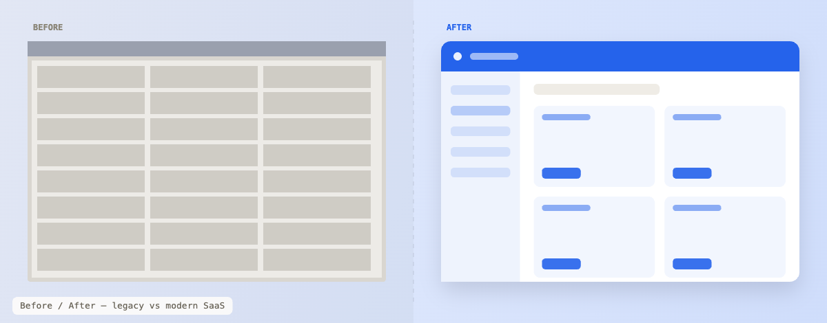
Same foundation. Distinct by theme.
What changes between products is intentional and deliberate — the theme. Each product visually distinct, immediately recognisable, but built on the exact same components underneath. A hotel employee moving from the front-desk PMS to the spa booking system never feels lost. The mental model transfers.
PMS — Property Management
Calm, confident blue for the front-desk heart of the suite — the app staff live in all shift long.
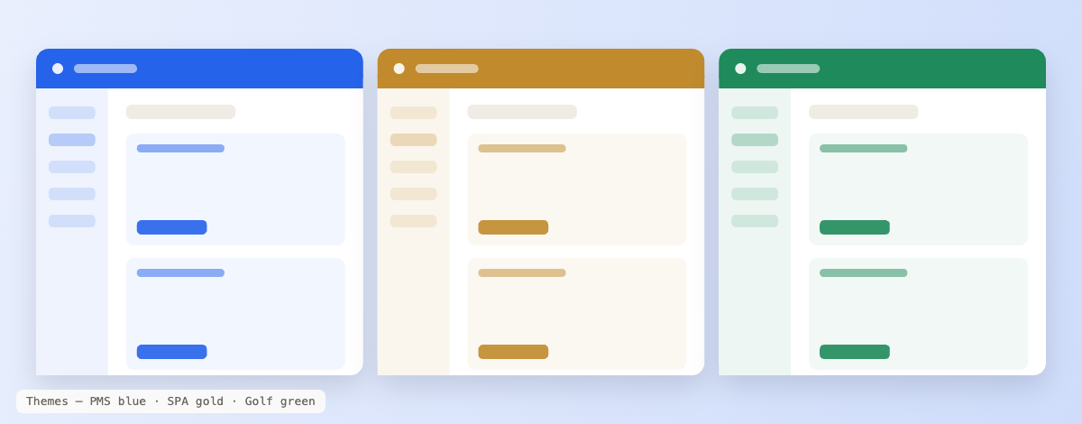
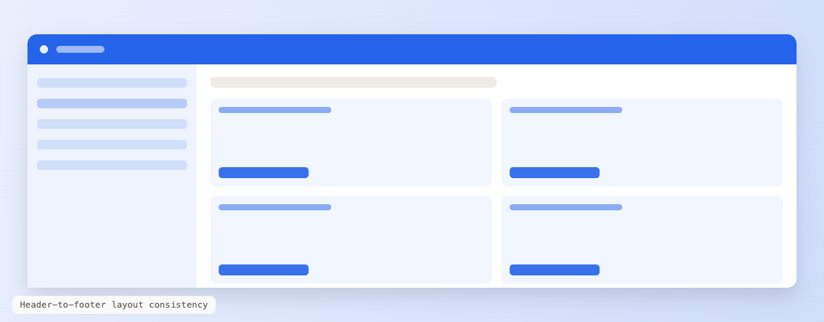
Built to scale. Designed to share.
The design system did not arrive fully formed. It evolved — shaped by the tools available, the products being built, and a growing understanding of how different users actually behave inside different applications.
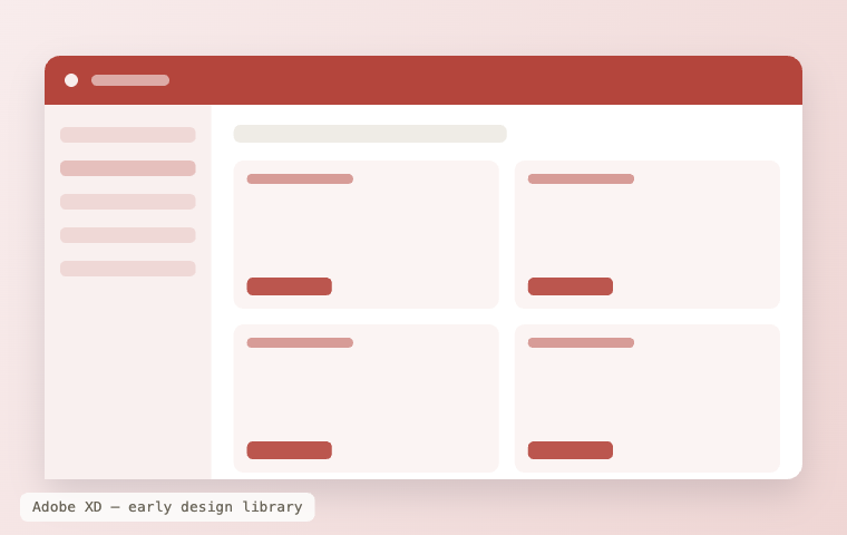
Adobe XD — where it started
The foundation was laid in XD. Design library files were created manually and shared between designers as the team grew — every designer working from the same source files, every component agreed and distributed centrally. It worked. But it had limits.
The architecture follows the user.
As the portfolio grew from one to fifteen-plus applications, a single monolithic system was no longer the right answer. The products were different. More importantly, the users were different — and different users behave differently. The architecture was restructured around that reality.
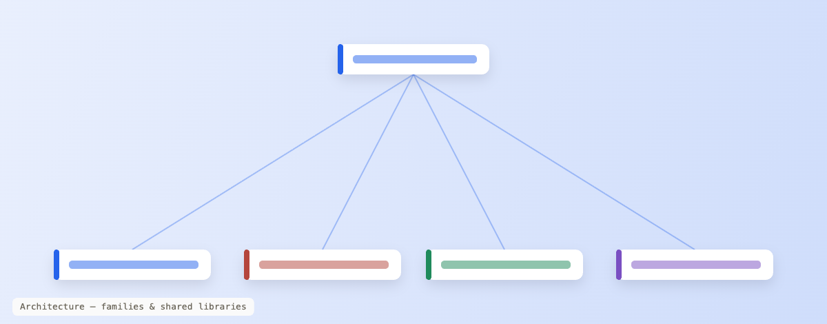
"When a new product enters the portfolio, it doesn't start from zero. It inherits years of decisions — and ships looking like it belongs on day one."
A system is a product. Run it like one.
A library nobody trusts is just a folder of files. The system stayed alive because it was governed — clear ownership, a contribution path for every designer, and a release rhythm the product teams could rely on.
The work before the work
Before any team could adopt, they had to believe in it. Dozens of conversations — with product leaders, engineering heads, BAs and designers. The message was always business outcomes, not design philosophy: less designer effort, faster builds, lower QA cycles, easier to sell.
Proof before mandate
The PMS modernisation was the proof of concept that opened every other door. We did not enforce adoption — we demonstrated value and let the results persuade. Pushback was addressed with evidence, not authority. No team was asked to simply trust the system.
Contribution & consumption
The centralised team owned the system — components, tokens, docs, versioning. Product teams consumed and raised feedback through structured review. Genuine gaps came back to the centre to be validated against the whole. No component created twice. No team in isolation.
03 — Where It Stands
Still running. Still growing.
Nearly a decade on, the system underpins the entire modern product suite — three generations deep, and the shared language for every designer and developer who touches it.
Applications across the hospitality suite built on the one shared foundation.
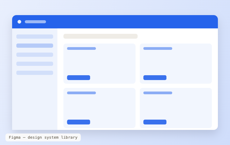
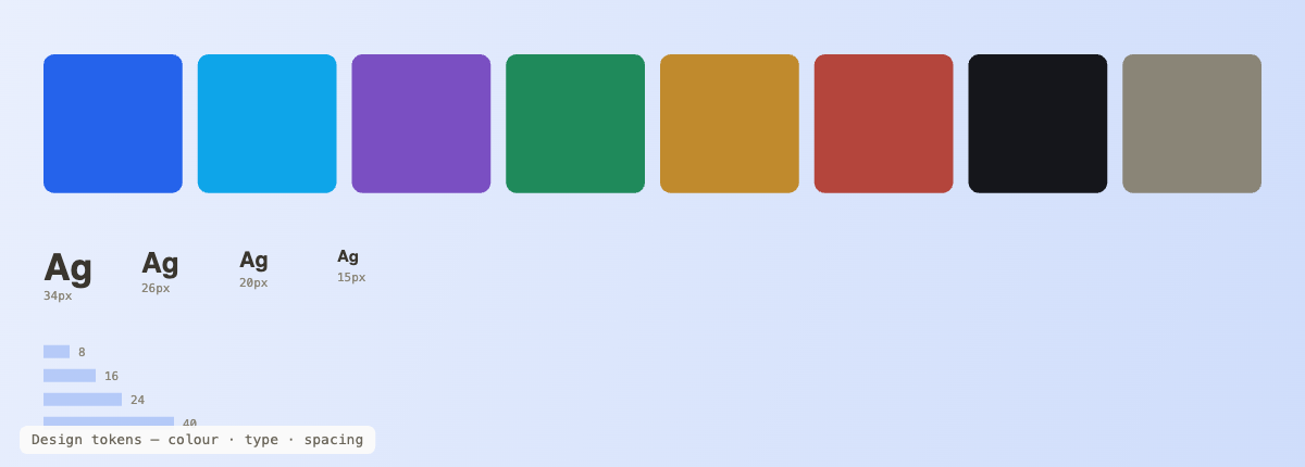
From manual XD libraries to token-driven Figma — evolving without breaking the products on top.
Founded it, scaled it, and still steward it as the team and portfolio grew.
The system is the story behind every case study.
Every product redesign in the portfolio was built on this foundation. See how it plays out in practice.